A Modern Farmhouse Bathroom Makeover
This past year I re-decorated our guest bathroom and gave it a major face-lift. I really, really wanted to tackle our master bath - and this is still on my list for another time - but my budget was small, so the guest bathroom it was! Once I started thinking about it, the guest bath gets the most foot traffic as it is on the main level of our home. Friends and family use it when they come over and you can see into the bathroom from the living room and dining room. It honestly made the MOST sense to start with this bathroom and I am so glad I did!
In thinking about what I wanted to change, the most important thing for me was that the elements in the bathroom (or any room in our home) flow with the decor in the rest of the house. That means simple design, clean lines, natural tones and a few modern touches. Although I would describe the style of our home as “city eclectic, with some traditional elements” I think “modern farmhouse” is probably spot-on, as well :)
I should also mention that I did our guest bathroom makeover with just decor and paint. I didn’t replace the vanity or move anything structurally in the bathroom. We did change out the mirror, the light fixture, and the light switch covers (among other things). All easy changes. I was amazed at how much of a difference these small changes made to the look of the bathroom!
I am very pleased with how it turned out. Check out the before and after photos below. Whether you are looking to accomplish a similar look in your own bathroom, or just want some inspiration, I hope you find this guide helpful! All of the products are available on Amazon and I’ve linked them directly.
Happy Decorating!
GUEST BATHROOM BEFORE
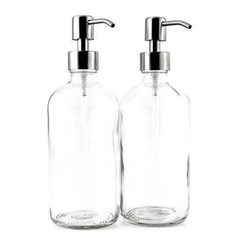
Lots of brown tones, which didn’t quite go with the black vanity. The mirror with no frame looked unfinished to me. The light fixture seemed dated. I took note of the silver/polished nickel elements like the faucet and the vanity handles. Since I knew we weren’t changing out any of the big pieces, I decided to work with the polished nickel, but make it consistent (bye, white plate cover. hello, brushed nickel.) I also noticed there was NO usable storage. Meaning, if someone was doing their hair or makeup in here, where would they put everything? Adding a floating shelf above the toilet became a necessity.
GUEST BATHROOM AFTER
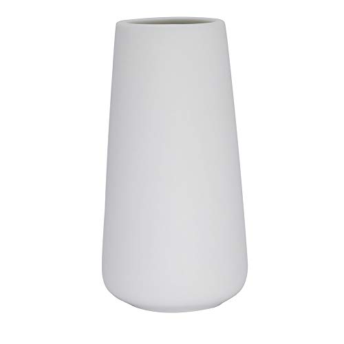
As you can see, the most dramatic change we made was the paint color. Taking the bathroom from warm tones to cool tones was super important for it to flow with the rest of the house. We chose City Rain by Behr for the paint and I still love it! We did the painting ourselves, since it is such a small space. At the time I took the AFTER photos, we still had a few touch-ups to do, but you get the idea. We kept everything else fresh by using white towels and shower curtain, faux greenery, and simple decor. Keeping the shower curtain closed also helps mask that brown and tan tile (which I don’t love).


